Overview
Muse is a tablet-based power tool for reading, thinking and developing your ideas. We tried make a tool that enables crafting of ideas and knowledge in a human, natural environment akin to a workshop or studio.
We built Muse as the Ink & Switch team, which is a privately funded industrial research lab. They run 3 to 9 months experimental projects around problems they identify, to later use the learnings in commercial projects or start spin-off startups from these projects.
They form temporary teams around each project (a la Hollywood model). I first worked with them on a 3 months project in 2016 where we created a speed-of-thought text note capture tool for iPhone. And the next time I was able to align my career plans around one of their projects was in 2018 when we started working on Muse.
Hypothesis:
“Creative professionals need a place to develop their ideas. And this seems to demand a freeform, fluid space where creative fodder can be mixed together and sorted to the user’s liking.”
Problem:
“Digital authoring tools like Google Docs orPhotoshop are designed to express ideas you’ve already developed, and productivity tools like email, calendar, or todo lists are good for tracking and administration. Surprisingly few digital tools exist for the early, freeform phase of ideation.”
Design goals:
• A repository for creative inputs.
• Freeform and arranged by you.
• Multimedia. Text, photos, sketches, PDFs, web pages, diagrams—all together to reflect your variety in creative inputs and your own thinking.
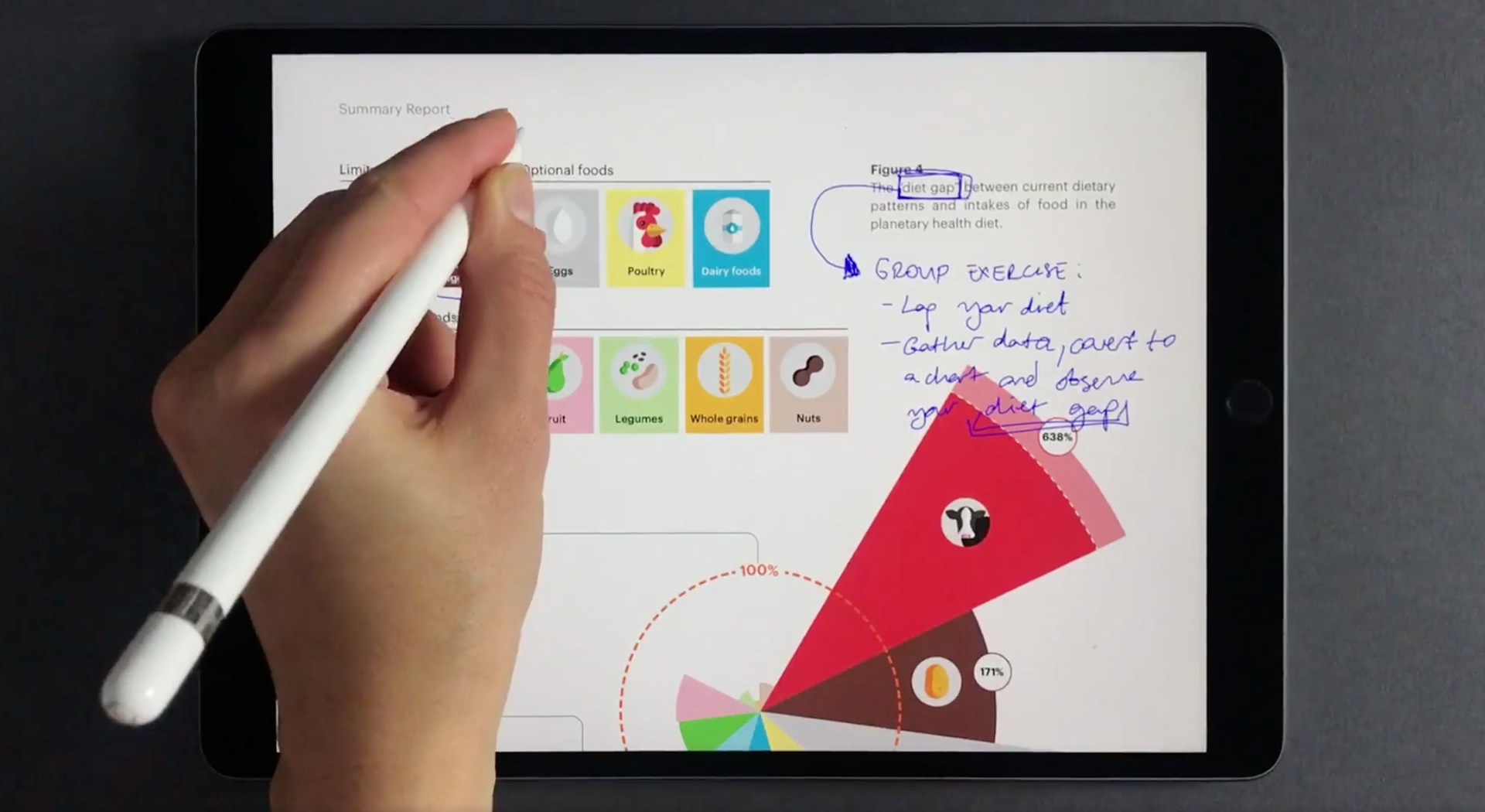
• Inking everywhere. Drawings, annotations, marginalia.
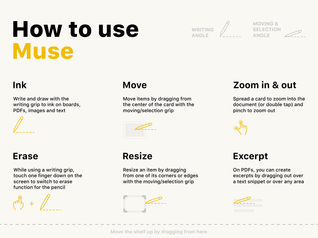
• Excerpting. In addition to freeform arrangement of entire documents, you may want to pull out just a sentence, a paragraph, a page, or a diagram from a longer document.
• Freeform and arranged by you.
• Multimedia. Text, photos, sketches, PDFs, web pages, diagrams—all together to reflect your variety in creative inputs and your own thinking.
• Inking everywhere. Drawings, annotations, marginalia.
• Excerpting. In addition to freeform arrangement of entire documents, you may want to pull out just a sentence, a paragraph, a page, or a diagram from a longer document.
Process
We were a team of 6 people: 1 product manager, 1 product owner, 3 developers, and myself. I was most of the time the facilitator of group sessions, and synthesised the outcomes of our group work. Our fully distributed team got together during the 3 core hours every day to solve problems together. Starting from the ideation till the end of implementation.
User research was an integral part of the project from the beginning to the end. We defined personas and found “anchor users” through our network. We conducted initial interviews with them, and as soon as we had a working product we gave it to those users and synced regularly to learn from their experience. I ran these sessions, and presented findings to the team.
Interaction design
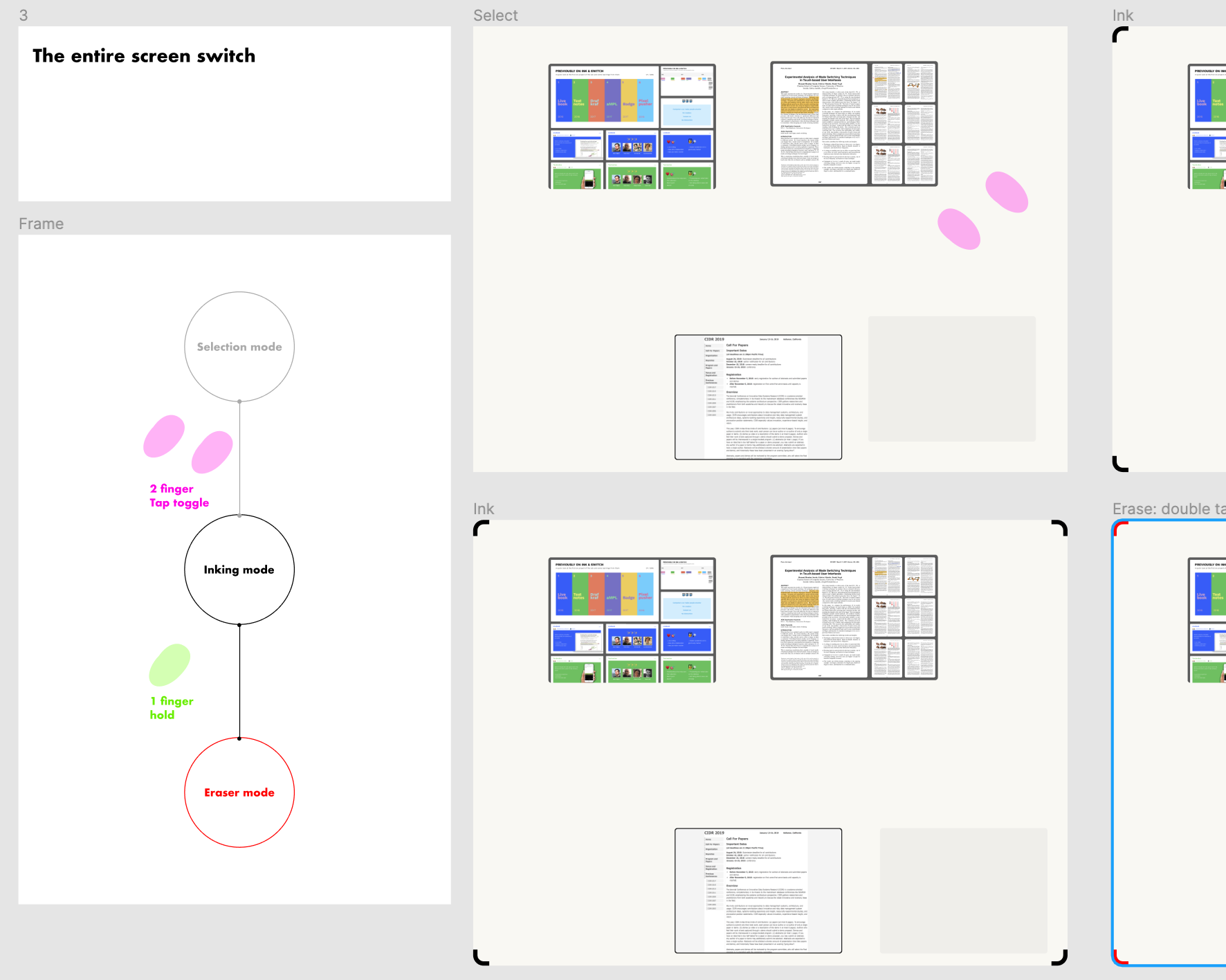
I used Principle, Adobe After Effects, and Figma to design and communicate interaction designs. I delivered interaction logic documentation and from there on we worked closely with developers to test, and rapidly iterate to perfect interactions. Since Muse is heavily a gesture based tool with minimal chrome, we spent a lot of time crafting our interaction logic to make it as "adaptable" as possible. We frequently validated our interactions with user tests.
I was also responsible with our visuals. I designed our brand assets, user guides and presentations including the videos we used to demonstrate Muse to the public.
Outcome & learnings
We published our research results as an article, and 3 of our team members later started a company with the same name, based on this research project. The commercial version of Muse is a public tool used by creators around the world.
I am extremely proud of all our experiments and the product we created in just 9 months. But, was there anything I’d do differently today? Absolutely:
1- We limited ourselves too much with the 1st core Ink & Switch principle
Even when the user research suggested that we should introduce some buttons for ease of use since the gesture space was getting too congested. Our core principles were:
Even when the user research suggested that we should introduce some buttons for ease of use since the gesture space was getting too congested. Our core principles were:
• No chrome. Avoid toolbars, buttons, or other administrative debris. Just you and your work.
• Fast. The studio should support creators moving at their natural speed of thought.
• Use the full command gesture space. As a fast, precise tool for creative professionals, we should use every capability at our disposal. That means all ten fingers, and the stylus as a distinct input. The stylus is required.
2- We were a team of passionate, ambitious and strongly opinionated people, which produced conflicting options very frequently.
I made some design decisions to accommodate conflicting opinions even when they did not feel completely right. Later I had to throw them away because they simply did not work. I learned that it is better to choose one path, give it a fair chance and if it fails, move to the next one.
3- Lack of documentation of design decisions during the process.
We tried a bunch of different ideas and explored different avenues. That was after all, the main purpose of the project. But as we moved quickly, we did not put enough effort in documenting all of our design decisions with the reasons behind them. This made it difficult to return to some of those ideas and reuse them.
We tried a bunch of different ideas and explored different avenues. That was after all, the main purpose of the project. But as we moved quickly, we did not put enough effort in documenting all of our design decisions with the reasons behind them. This made it difficult to return to some of those ideas and reuse them.